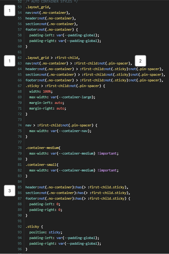
REM SETTINGS
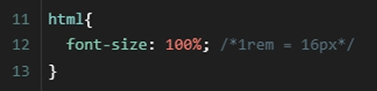
REM — a relative unit in CSS that helps create more accessible and scalable websites. It refers to the font size value in the HTML element, which is taken from the
browser's main font size settings. By default, this value is 16px.
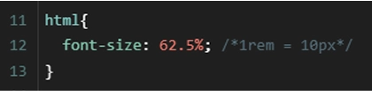
Example in CSS:
In effortless, the default font-size for the HTML element in CSS has been set to 62.5%. As a result, the default font size is now 10px (instead of the standard
16px).
Benefits of this change:
-
Easier REM unit calculations and more readable code. Instead of converting sizes, you can write values in
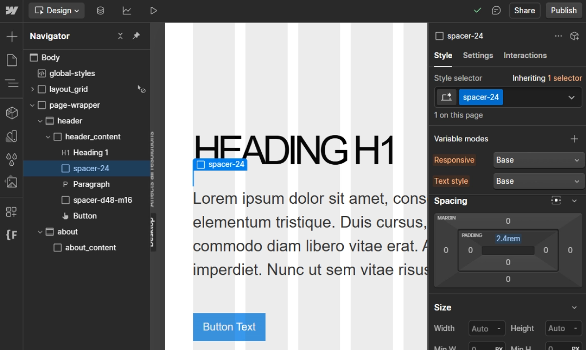
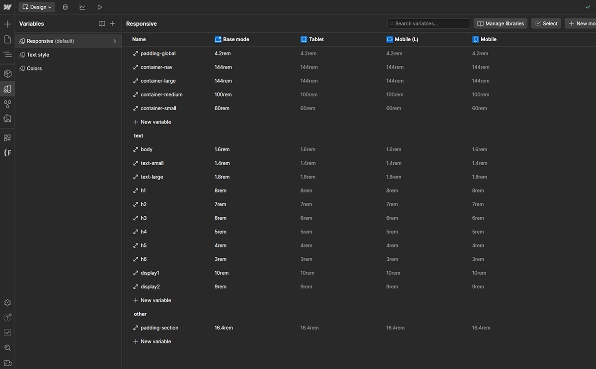
remas decimal equivalents of pixels, e.g.:font-size: 16px → font-size: 1.6remfont-size: 24px → font-size: 2.4remmax-width: 1440px → max-width: 144rempadding: 48px → padding: 4.8rem -
The ability to set the default
font-sizeon thebodyto 1.6rem or another value, simplifying font size inheritance for other text elements. -
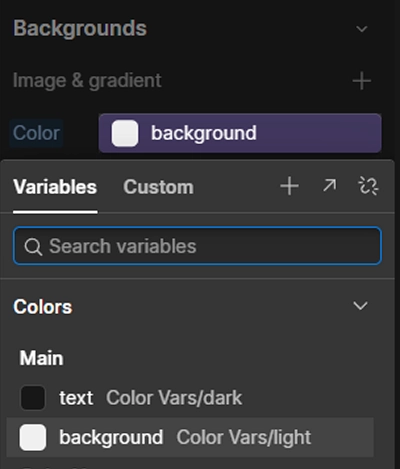
Better collaboration with designers — in tools like Figma, font sizes are provided in pixels.
Remember
Remember the new value font-size: 62.5% for the HTML element. Pay special attention to areas where external scripts from other companies are implemented on the site,
such as chatbots, cookie banners, which may rely on the default value of 1rem = 16px. This could result in smaller sizes.
Popular tools like CookieBot or chatbots display sizes correctly because they use pixel units instead of rem. Therefore, such cases should be rare. If you encounter issues with
incorrect scaling, you can override the CSS styles using !important. As a last resort, you can use transform: scale(1.6) with the appropriate
transform-origin — although this may not always work.
If your components use the default browser font-size, you'll need to adjust them to the new rem value. Multiply them by 1.6.